Defending the Crown
A National Team, A Cultural Moment.
Defending the Crown is a documentary project centred on the Belgian National Basketball Team — capturing a defining chapter in their journey on the international stage.
But this wasn’t just about documenting games or results.
It was about identity, momentum, and pressure. About what it means to represent a country while expectations rise and margins tighten. About defending status, reputation, and belief — not in theory, but in real time.
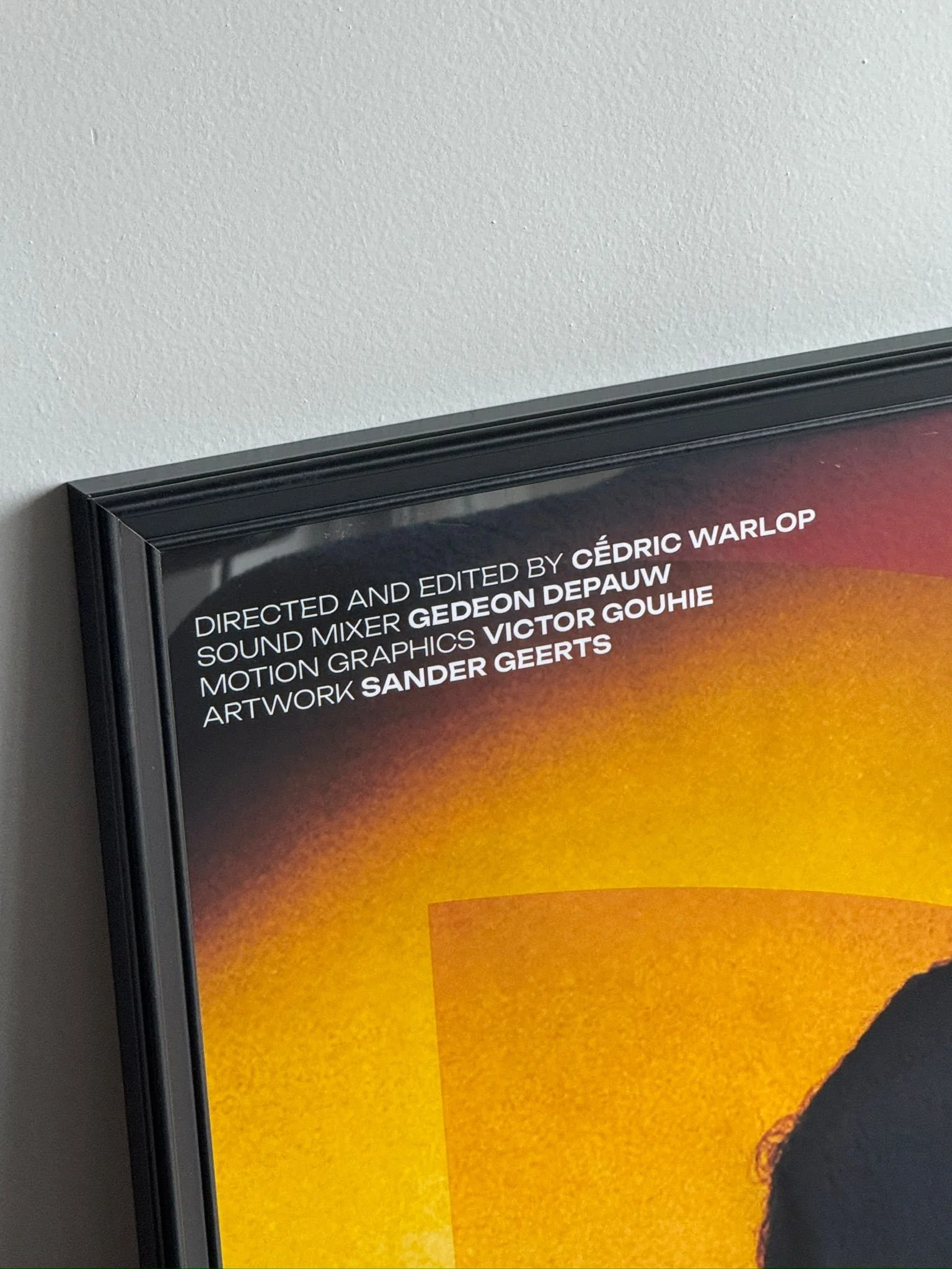
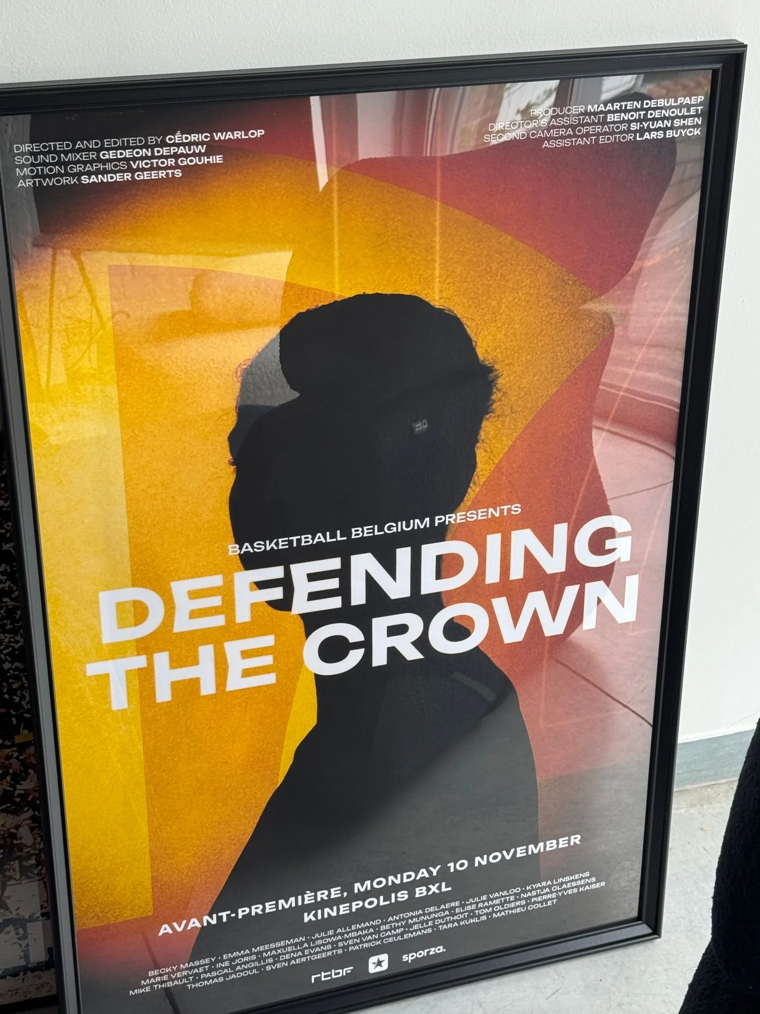
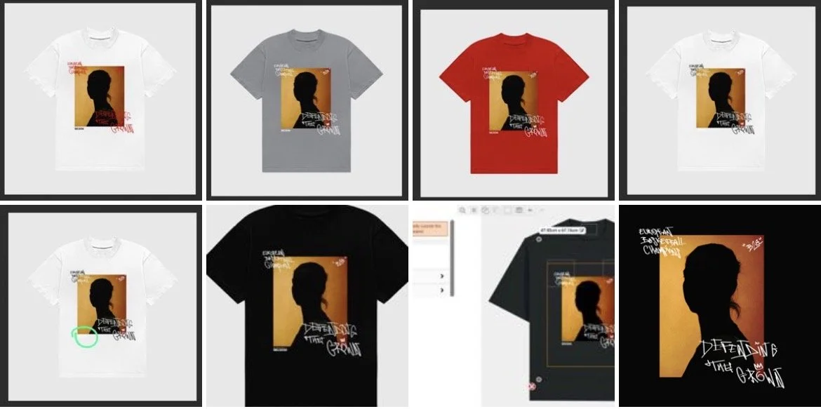
From the outset, the creative direction extended far beyond the film itself. At the request of documentary director Cédric Warlop, I led the development of a modular visual system to support and amplify the documentary, built to scale across broadcast, physical merchandise, digital platforms, and cultural touchpoints.
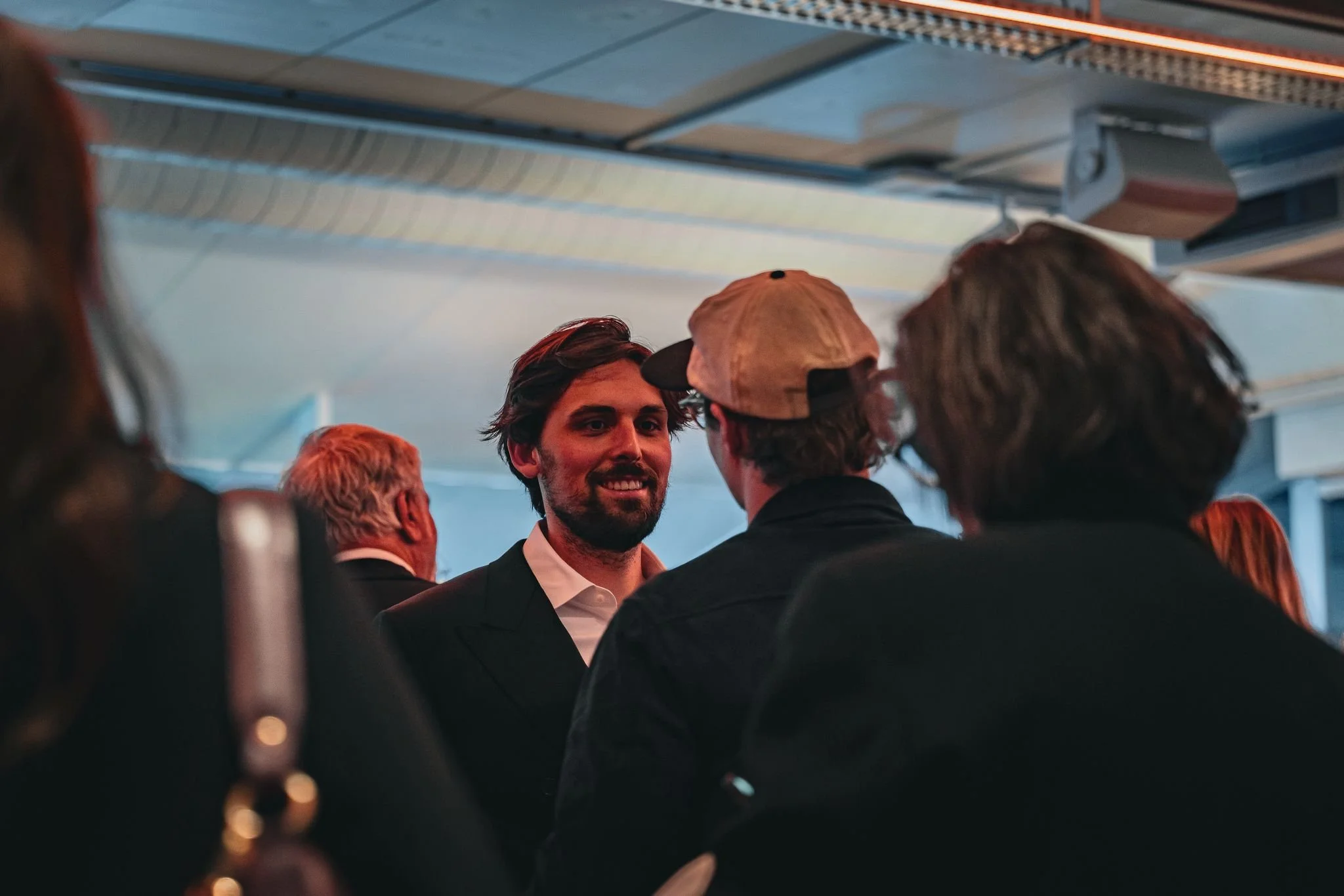
Cédric Warlop and Sander at the Avant Premiere in Brussels
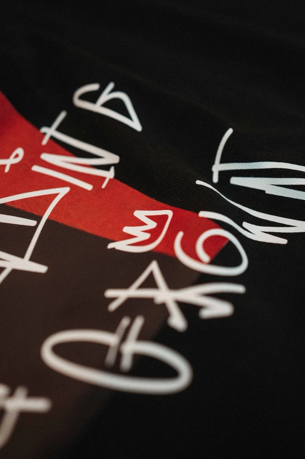
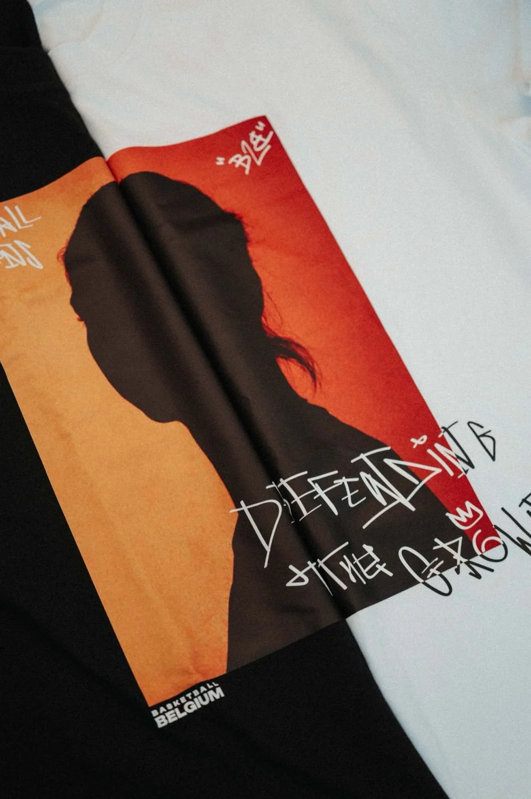
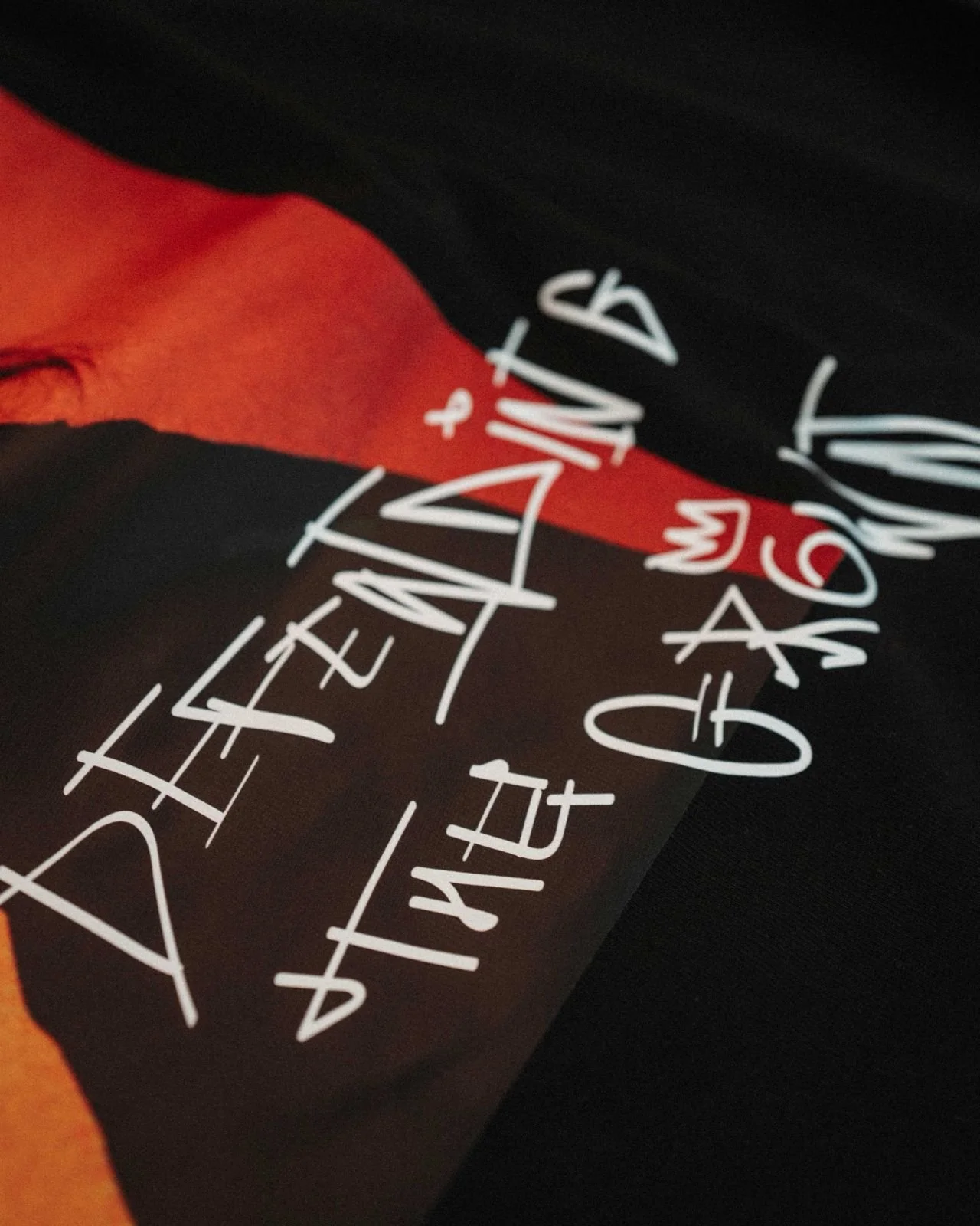
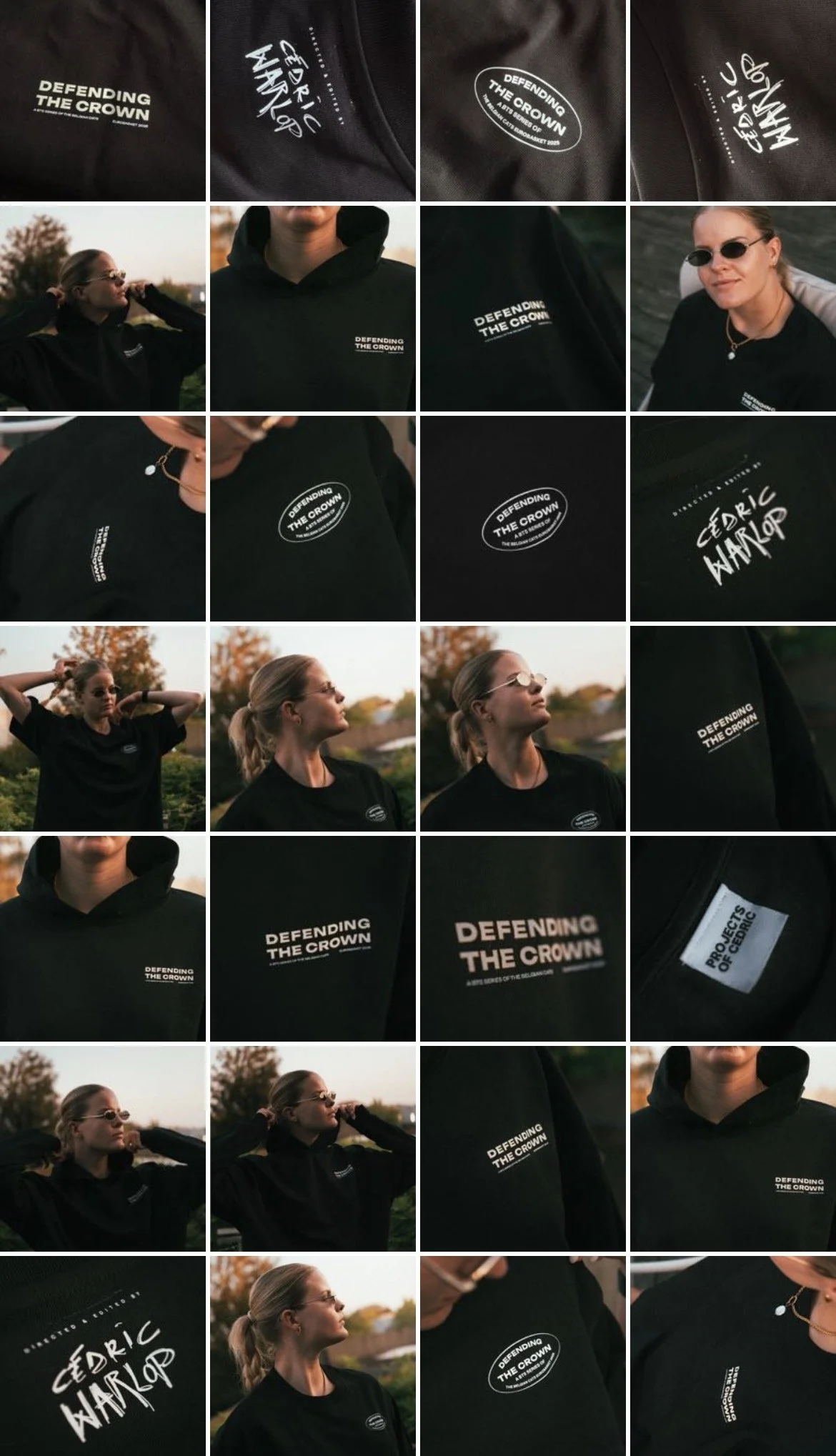
What you’re seeing in the artwork is deliberate breadth:
Final, approved assets
Alternate directions and unused concepts
Typographic explorations
Poster systems
Apparel mock-ups
Stickers, labels, and graphic treatments
This wasn’t “extra work.”
It was strategic exploration — stress-testing the identity to ensure it could scale, adapt, and still feel coherent.
The aesthetic language strikes a balance between authority and restraint. Strong typographic hierarchy. Controlled colour usage. Minimal symbolism. Nothing decorative for the sake of it. Everything earned. Everything functional.
The documentary aired live on national television, reaching over half a million viewers, and premiered earlier in an avant-première screening in Brussels. That reach matters — not as noise, but as cultural penetration. This project didn’t sit quietly on a shelf; it entered public consciousness across both industry and public audiences.
For me, Defending the Crown represents how I like to work:
One core idea
One clear narrative
Built out into a complete, flexible visual system
This blog post is about making the work visible and contextualised.
A full case study will follow, unpacking the creative decisions, unused paths, and how the system was built to seamlessly transition across mediums without losing its essence.
For now, this is the marker in the ground:
The work exists, it landed, and it mattered.
